May 2, 2010

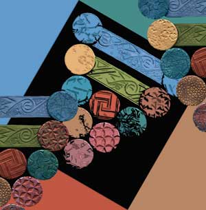
Since it is Spring, I’m not only finishing up my final projects for school, I’m doing a little spring cleaning both at home and on the business side of things. I’ve used my own name “Sarajane’s” for a long time because I do a lot of different things that don’t fit neatly under one title. I make costumes and dolls, stories and graphics and books, websites, dolls, ceramics, textiles, polymer clay…my interests wander around a lot, but they come back together on many points. But I never really liked how it looked on the display cards, and I’ve tried LOTS of variations. “What to do,” I wondered to myself yet again, trying on some new looks for business cards much like a new hair style or bathing suit for the Upcoming Season. What would cover the digital, polymer, textile, ceramic aspects of where my creative stuff connects? It didn’t really hit me (sometimes these things take a while) until I was looking for an image to use as a favicon.ico file for my websites, and I looked at the one I use for the header of the Creative Connections blog. Polymer clay, textiles, digital manipulation..duh, Dorothy, there is no place like home. So today I played around a bit and designed a new business card and hang tags for the items I’ll be selling. It’s fun to try on new looks!
I have been studying programs like Adobe Photoshop, Illustrator, InDesign and DreamWeaver at Front Range Community College. Plus I’ve taken courses in ceramics, digital photography and creative writing! It’s great to use my hands and my brain both, and to learn new ways of doing art. Four semesters of soaking it up and learning as much as I can possibly hold, and now its time for a couple of months putting all that I have learned in my classes to good use. I’ve got a big schedule for my “summer vacation” that includes finishing the photography and editing of my upcoming book “A Collection Of Polymer Clay Masks”. It’s under way and going to be in print by October of this year. I have booked the majority of the summer just for this.
I’m also going to be be an instructor at Tougaloo College’s Summer Art Colony for a week in July. The annual Dyeing Days are coming right up the first week of June when we’ll be getting Very Colorful, and I’ll be making lots of beautiful new things and packaging them up for sale. That’s my backwards count-down of what I will be doing for the next few months, along with liberal applications of gardening and the occasional hike into the mountains. It’s important to get outside and remember what a beautiful place the foothills of the Rocky Mountains is, particularly in Spring.

May 5, 2009
I’ve had a great time at college this semester. My favorite class has been Adobe Illustrator 1 , and I’m looking forward to taking level 2 this fall. Adobe Photoshop has long been a favorite tool and plaything both, but although I had an ancient version of Illustrator, I didnt use it. I’d poked around with it a few times, but it’s not intuitively easy to pick up just by poking the buttons, and the Pen tool is downright scary without a little guidance. But Oh—–!!!! Once you get a bit of familiarity, this program is the Magic Coloring Book that I dreamed about when I was little…the kind that can be any picture you can imagine and drawn much more smoothly than I could manage by hand. The kind you could color in and then change all the colors to different one just by picking them!! “Darker green there…no, blue.” And the 3D modeling makes this program extra sweet. I’m not so great with perspective and mathematical formulae, but the computer is, and it makes creating images a LOT of fun. Of course, there’s so many choices its also difficult, but thats the way it is with any art, and its all part of the fun.
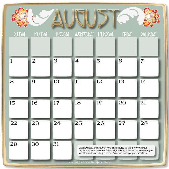
Here are two images I created using Adobe Illustrator. The assignment was to make two calendar pages. You can see the other one over at Aunt Acid’s blog.
Aunty is a wonderfully patient model. She’s shown in these two images in homage to the art nouveau stylings of Alphonse Mucha. I’m looking forward to spending months learning more about this program, now that its not quite so intimidating.

Nov 28, 2007
 I love books. And while I am a big fan of stories and words, I admit that I also get them just for the pictures. I adore going to the public library and I believe that thats where the “free” part of free speech finds its most equally available home in America. Anybody–absolutely anybody–can go there and look at books and magazines, as long as they are behaving themselves in a non-violent way. But though I keep many of “my” well-loved books on the shelves of the library when I’m not reading them, there are some that I just have to own outright and keep at my house for whenever I want them, no sharing neccessary. Two of my favorite places to buy books are at Amazon and through Bud Plant’s catalogues. Mr. Plant specializes in very reasonably priced art and comic art books. Great illustrators, wonderful compilations—it is a treasure trove. I’ve recently updated my Books section on my web site with two pages of recommendations from the newest selctions there. And, there are also 4 updated pages of books available from Amazon having to do with dolls and miniatures, textiles, and more.

The book shown above is Ukiyo-E, Japanese prints from the “Floating World”, which has been a HUGE influence on my own artwork. Japanese prints also influenced the work of artists like Mary Cassatt, Van Gogh, and other greats. I like to use the pictures as reference when making my Japanese girl beads and pins with polymer clay. The colors in these meticulous block prints really speak to me–even though they were created as much as 150 years ago!
May 5, 2007
 A lot of my endeavors tend to collect up against each other or tie into each other eventually, and not just in the piles that accumulate all over the studio. I have a love of pattern, a deep and abiding joy in colors, and I just adore a good black outline. And although I am willing to admit that I am addicted to buzz I get from a good strong jolt of color, I also do a lot of work in black and white and find the clarity of composition in a pen drawing to be very compelling. Am I caught betwixt and between the B/W vs. Color issue? No indeed, there’s room in my heart and my studio for both.
 As an example of how things tend to mix it up, both in my head and in my eventual finished product, here’s a look at a drawing I did a long time ago. It began with black ink and my trusty Rapidiograph pen, long since traded in for Micron pens that don’t clog!
I made sure to make a master copy of the drawing before I colored it in, because I though other people might enjoy coloring the pictures too–so I have sold the set of 10 drawings as a coloring folio over the years. I still get a kick out of the details, if I do say so myself.
After I finished the pen and ink drawings, I had a lovely week of coloring fun for myself. It was a treat! I prefer Prismacolor markers, the kind with a chisel tip on one end and a point tip on the other. They are very versatile. They can be used to ink in designs on polymer clay as well as on paper, and don’t bleed into the clay.
 Here’s a look at the same page, with the color added. I used the Print On Demand publishing capabilities at Lulu.com to create a calendar that features my Little Piggy drawings and silk painted borders by Chris Murphy. The calendar is available through my own publishing imprint, Polymarket Press. Lulu makes it possible for the enterprising author/artist to create and publish with no minimum print runs. It is a fabulous online resource for all creative entrepreneurs.
Recently, I took the scans of the drawings that were used to create the calendar and reduced them using Adobe Photoshop. Using photopaper copies printed out here in the studio, I transferred the colorful images to polymer clay. That’s the bitty-book you see at the top of this post. It won in last years designer competition sponsored by AMACO. All the pages are made of FIMO polymer clay with liquid clay transfers. For more info about this process, click here.


 I love books. And while I am a big fan of stories and words, I admit that I also get them just for the pictures. I adore going to the public library and I believe that thats where the “free” part of free speech finds its most equally available home in America. Anybody–absolutely anybody–can go there and look at books and magazines, as long as they are behaving themselves in a non-violent way. But though I keep many of “my” well-loved books on the shelves of the library when I’m not reading them, there are some that I just have to own outright and keep at my house for whenever I want them, no sharing neccessary. Two of my favorite places to buy books are at Amazon and through
 A lot of my endeavors tend to collect up against each other or tie into each other eventually, and not just in the piles that accumulate all over the studio. I have a love of pattern, a deep and abiding joy in colors, and I just adore a good black outline. And although I am willing to admit that I am addicted to buzz I get from a good strong jolt of color, I also do a lot of work in black and white and find the clarity of composition in a pen drawing to be very compelling. Am I caught betwixt and between the B/W vs. Color issue? No indeed, there’s room in my heart and my studio for both.
 Here’s a look at the same page, with the color added. I used the Print On Demand publishing capabilities at
